Light can make or break a room and it’s really important to find the right balance between natural and artificial light. The best way to do this is to really understand what light you are going to gain from your chosen design. Lots of our clients in Design want to want to flood their home with lots of light but more don’t necessarily mean good.
It is our job to guide our clients throughout the design process and ensure they are left with a bright, airy space that looks fantastic both in the day, and at night. We’ve put together some tips on how much light you can expect from different design options.
It is important to think carefully about your current and proposed space, and we advise you consider the following 3 questions:
- Where are your current light access points?
- Where are the darkest areas in your current space?
- What areas will you want to prioritize light entry?
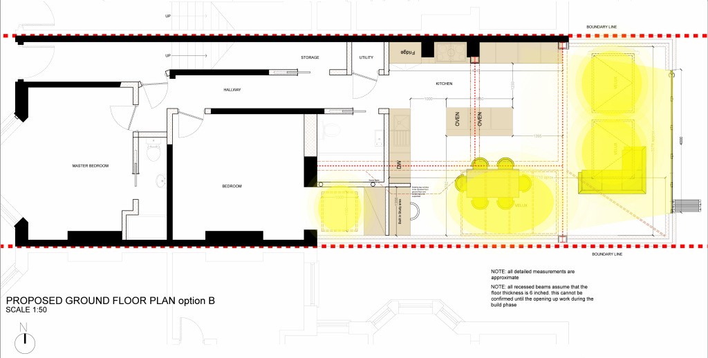
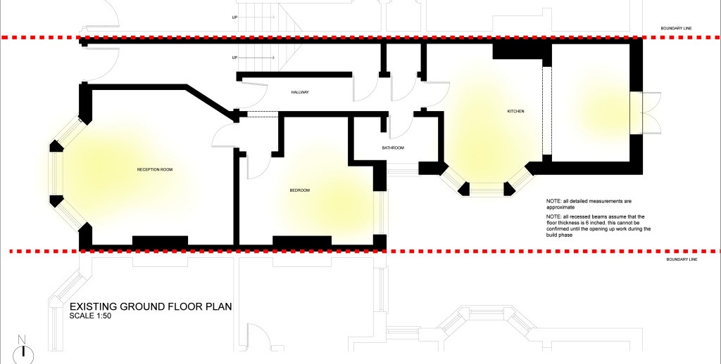
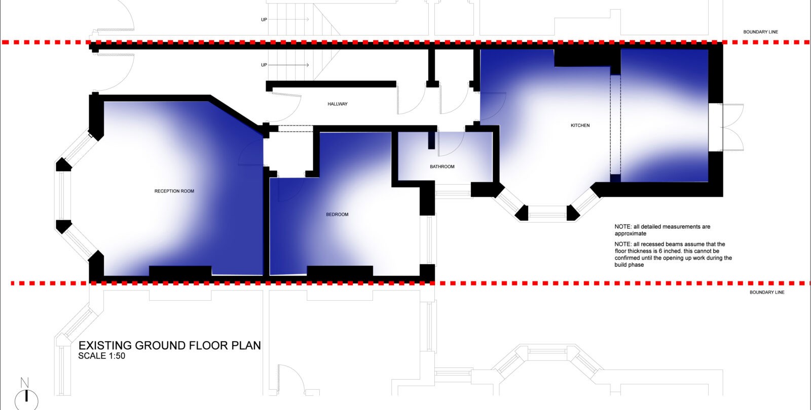
To help you visualize how to answer these questions we have drawn up a diagram which shows exactly where natural light will enter this property.
- Where are your current light access points?

- Where are the darkest areas in your current space?

- What areas so you want to prioritise light entry?
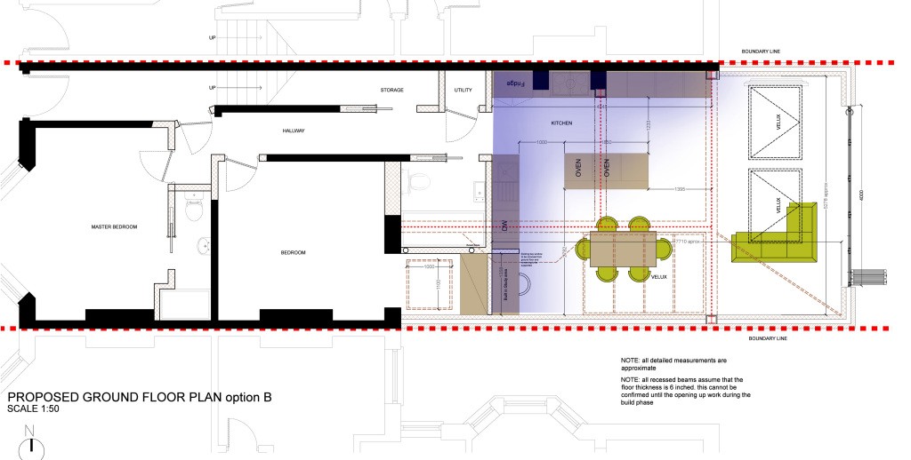
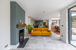
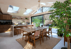
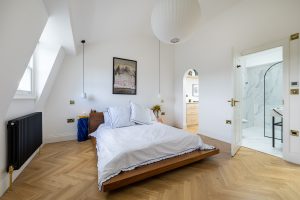
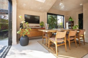
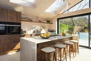
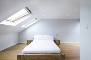
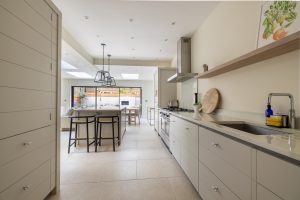
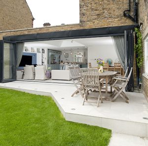
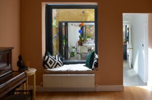
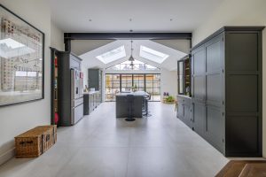
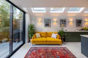
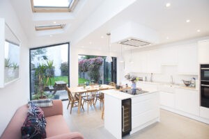
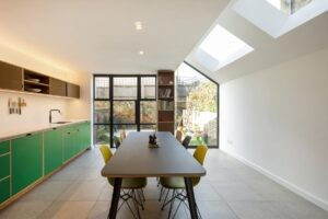
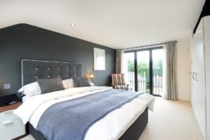
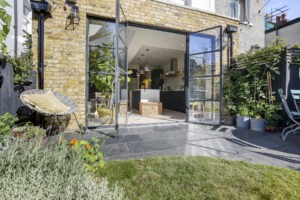
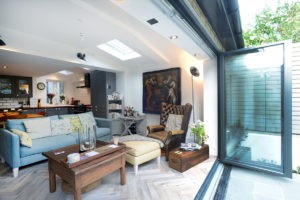
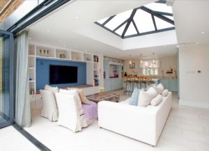
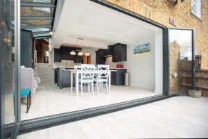
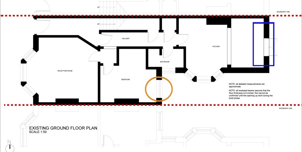
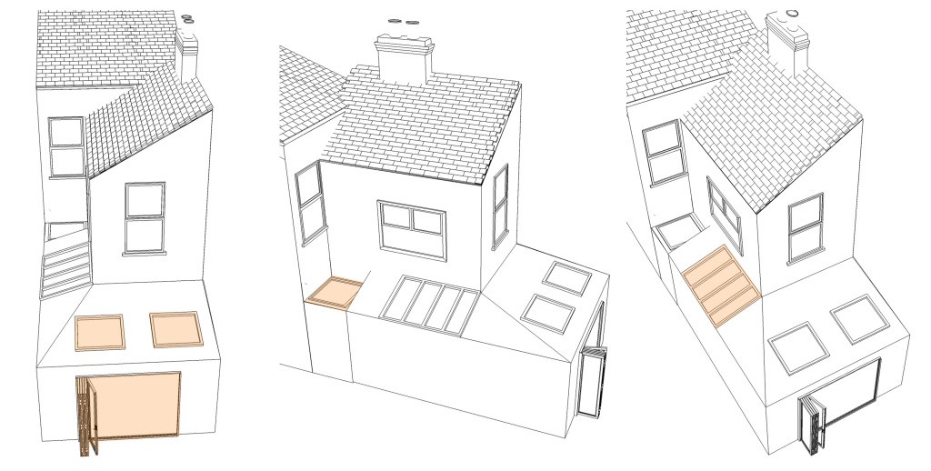
 Our Design Team took all of the considerations into account and proposed the design below. They opted for a wraparound extension that featured 3m bi fold doors that would bring a burst of light throughout the extension at eye level as well as 2 Velux windows to penetrate light from above. They then chose to include a skylight on a flat roof over the bedroom to keep light flowing into that space. Finally the client and designer agreed on a glazed panel area to optimize the entry of light in an aesthetically pleasing and contemporary way.
 Here is the result, check out the difference from the existing floorplans!
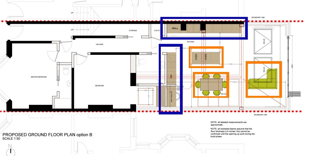
 We then advised our clients to arrange all of their furnishing to complement the light in their new space. We would advise that furnishings like storage, which does not benefit from natural light, to be located in the darker areas where there is more limited lighting (furnishings boxed in blue). You can then organize the social areas such as seating and kitchen islands, which would benefit from having access to natural daylight, to benefit from the new light entry points (furnishings boxed in orange).


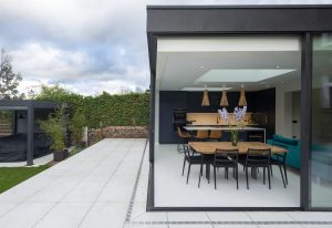
 Here is the result, check out the difference from the existing floorplans!