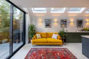
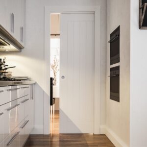
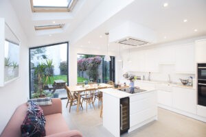
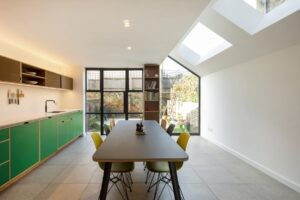
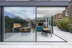
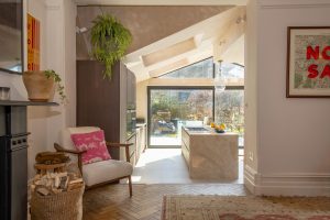
Over 15 years of kitchen design, we have seen changes across the materials used with different styles being adopted, unique furniture, fixtures and fittings choices and with trends coming in and out of popularity with our customers. Despite this constant change, we have found that good design is timeless.
Here at Build Team, to celebrate 15 years of designing kitchens and home extensions, we wanted to take a look back at some of the design layouts and changes of approach over the years.
From sculptural lighting to interior & landscape zoning and themes, there are so many ways to approach your home extension. We hope that some of the projects we have worked on can help inspire your own project.
2015 – Klea Avenue
Unique lighting, pastel blue storage and wooden finishes, this project oozes character and personality and even features a wine cellar in the basement.
2016 – Lyham Road
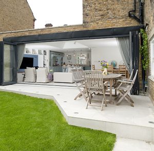
With antique furniture to offset a thoroughly modern extension, the white walls and ceiling complement the colour palette and unique aesthetic of this home.
2017 – Clyde Road
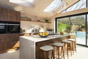
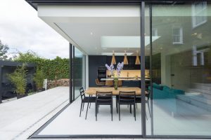
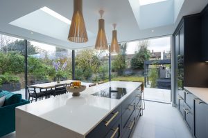
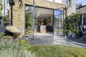
Digital art, a sculptural kitchen island and glazing which opens the interior into a beautifully landscaped garden. This kitchen extension is contemporary and forward thinking, with a layout which encourages movement and social spaces.
2018 – Thorpedale Road
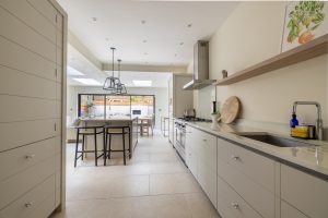
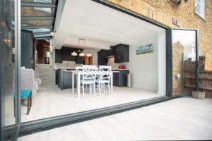
Using all of the best elements from previous designs, this project feels spacious and bright, with key elements such as a kitchen island and lots of storage laid out in a way conducive to cooking, socialising and walking through the space with ease. Colour adds delight, as do vibrant fixtures. Crittall doors are an excellent design feature to complete the look.
2019 – Hubert Grove
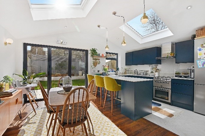
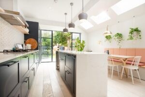
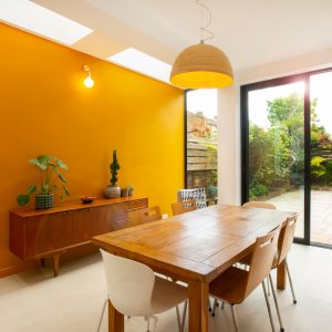
Details such as a terrarium, house plants and clever kitchen utensils bring together this large and welcoming kitchen and dining area. Mustard dining chairs juxtapose navy kitchen storage to create interest, while sculptural lighting and lots of natural light create a space which is both interesting to look at and highly practical to live in.
2019 – East Dulwich Grove
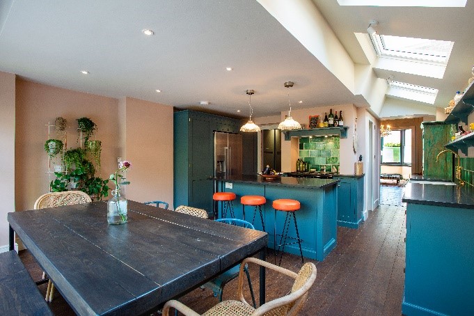
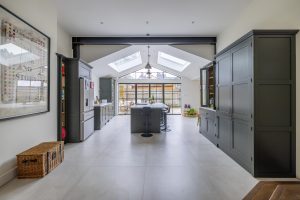
This space has an industrial feel, whilst maintaining a sense of home through splashes of colour, thoughtful finishes and a walkway which floods with natural light.
2021 – Therapia Road
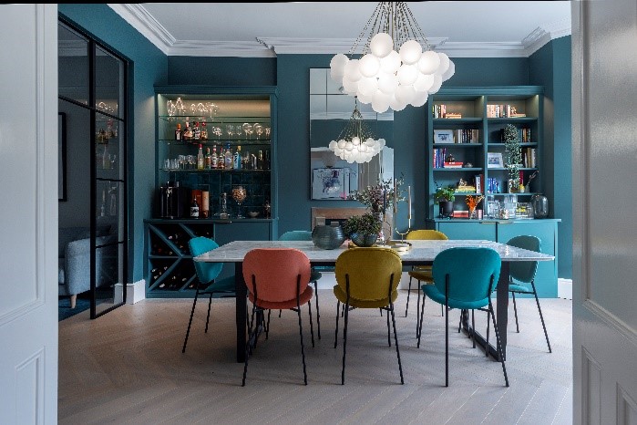
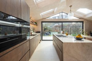
This project showcases how an excellent layout, and strong interior can create a space which offers feelings of comfort, luxury and space whilst sharing personality and points of interest.
2022 – Charleville Circus
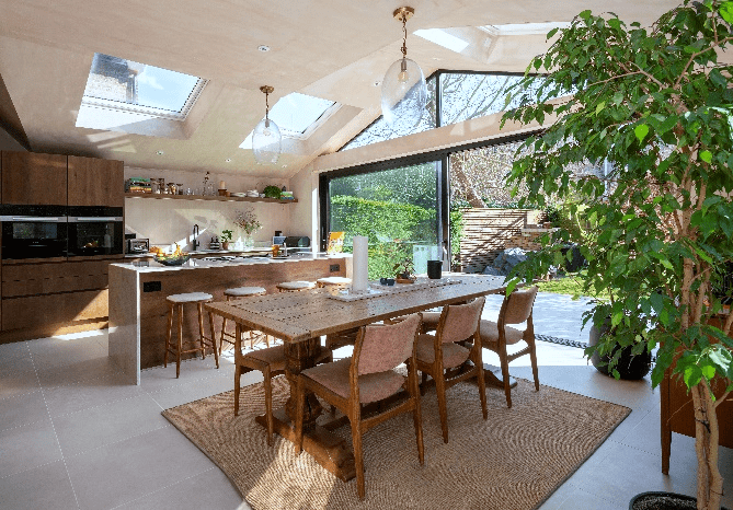
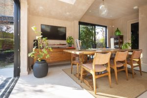
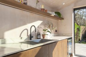
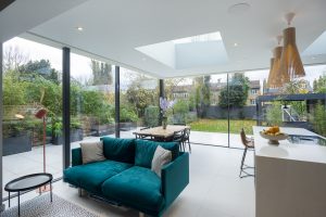
Natural furniture, materials and colours create a space which is peaceful and calm, with areas to socialize, eat, work and make. The space blends the interior and exterior which creates the effect of more space and a retreat like aesthetic.
As we develop our practice from the years of experience we have, we take the best elements from these projects to provide you with different solutions.
These projects all illustrate the varied approaches to a well-designed extension and we hope that you will be suitably inspired to start your own project.


