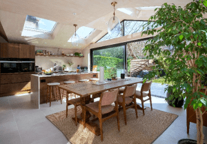
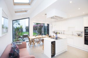
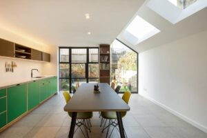
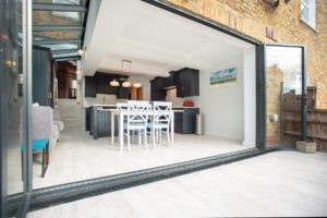
The kitchen is often considered to be the heart of the home, particularly in open plan living. In a space that’s used both to prepare food as well as socialise, the design of your kitchen extension is an important aspect to consider. Kitchens should be designed with efficiency in mind, but that doesn’t mean you have to sacrifice the design. To help you design your kitchen, and keep it practical, we’ve explained the ‘magic triangle’ rule below.
The imaginary lines of the ‘magic triangle’ are those which connect the three most important appliances and amenities in your kitchen – the cooker, the fridge and the sink. We suggest that there are between four and nine feet between each corner of the triangle, depending on the space you have available. It’s also a good idea to allow a minimum distance of 1.2m between units which face one another to give you enough room to move around easily.
There are several layout options available which make the triangle possible:
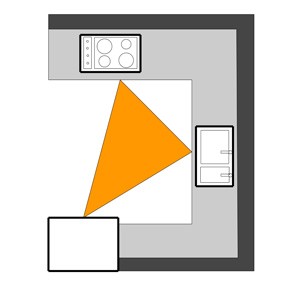
U Shaped Design
The U-Shaped Design allows you to maximise the space available by providing plenty of work top space within your kitchen extension.
The U-shaped layout is an efficient design for both small and medium sized kitchens, as it offers both large amounts of storage space, in the form of units and worktop space.
This layout is not, however, always as efficient for larger kitchens. This is because the distance between the three main points is greater.
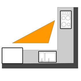
L Shaped Design
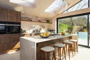
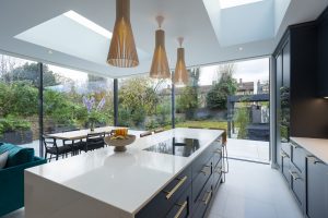
The L-Shaped Design is a popular design for kitchens of all sizes. This particular shape is complementary to a kitchen island should you wish to incorporate one.
The L shape runs along the two walls of your room – which can create a good working triangle as you won’t have to walk far to reach each of the three amenities.
This option is great as it creates a zoned section within the overall room which is great for open plan living. This means you can fully engage with the rest of the room, whilst cooking a meal in the kitchen area.
G Shaped Design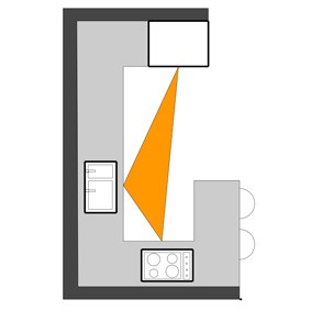
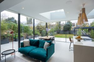
The G-shaped design can be beneficial in helping to zone the space in your side return extension by creating separate living and cooking spaces. Much like the U-shaped design option, this style also allows for more storage and worktop space. The positioning of the units allows the kitchen to become a self-contained zone, a little more secluded from the rest of the extension. This helps reduce the traffic passing through and is a great option for those of you with toddlers and young children.
Parallel Wall Design 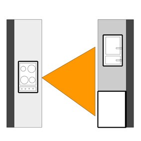
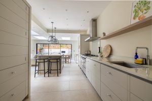
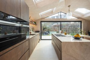
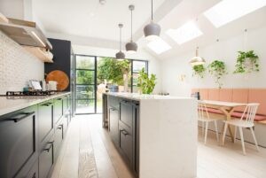
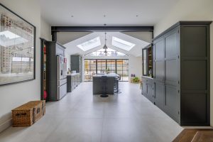
This option is great for those of you who want to incorporate an island into your kitchen design. The counter top along the wall and the island are positioned parallel to each other to allow you to move easily between both units. This design usually has two of the amenities positioned on the wall side with the final one located on the island. It is important to make sure that you have enough room to move on both sides of the island, so it doesn’t become an obstacle sitting within your living space.
By planning ahead, and choosing a design which will best suit both your own preferences, as well as the shape of your new extension, you can help ensure that your newly added space is used effectively and efficiently.


